Style guide
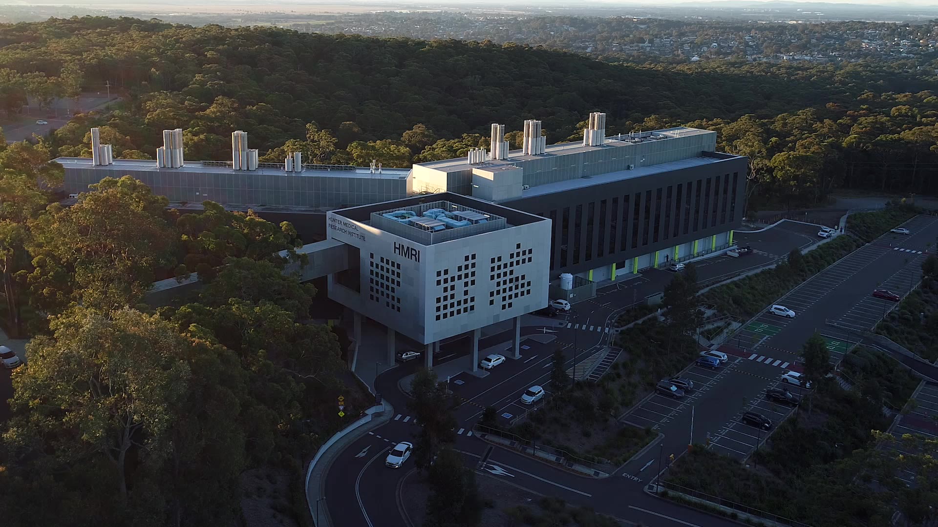
Our brand identity has been created to reflect the dynamic, vibrant, innovative organisation that is Hunter Medical Research Institute (HMRI).
It's a system that can be flexible and adapt based on the content it needs to support – to look, and sound, as diverse as our research.
This guide provides information, instructions and examples to help you communicate the right messages in the right way every time you create new materials under the HMRI banner.
We're aiming for all our brand communication to consistently reflect HMRI's values, personality, and visual aesthetics. Maintaining consistency across all our platforms, channels, and media, regardless of who creates the content, helps us build trust, recognition, and brand loyalty among our audiences.


We're taking healthy further
so you can live your best life.
What is “We’re taking healthy further” about?
A strapline, tagline or slogan is a concise and impactful phrase that encapsulates the core message and vibe of a brand. It serves as a powerful tool in marketing and communication, reinforcing brand identity and leaving a lasting impression on audiences.
“We’re taking healthy further” represents what the HMRI brand is about. We’re a brand for people who want to be their most healthy. We want HMRI to be their go-to because we turn our world leading research into simple, practical and helpful advice so they can live their best lives. It’s designed to resonate with our audiences, conveying our dedication to collaboration, community and healthcare transformation in every aspect of what we do.
You’ll see “We’re taking healthy further” across HMRI’s marketing and communications assets, campaigns and more.
Our vision:
Discover local.
Cure global.
By mobilising our unique local ecosystem, we can advance new medical research that anticipates emerging health trends, issues and challenges impacting the million people who live here, and act quickly to respond before they become major issues. And anything that works here can be scaled up to work anywhere else in Australia.
Translating our research into real-life care for everyone on the planet is the ultimate goal.

Our purpose:
To transform the health and wellbeing of our communities.
Keeping our focus steady on the translation of research for the benefit of community health, no matter where someone lives or what life stage they're at.

Values:
- Always curious in the pursuit of impact.
- Unafraid to challenge and change.
- Striving to improve.
- We’re community-minded.
- We understand our own role in the whole.
- And we listen to each other so we can understand everyone’s challenges. Then help them.
- Honest and straightforward
truth with empathy and respect. - We’re frank and constructive.
- We solve problems together.
- We collaborate across our ecosystem.
“No one can whistle a symphony. It takes an orchestra to play it.”
H.E. Luccock
About HMRI:
Hunter Medical Research Institute (HMRI) exists to transform the health and wellbeing of our communities. As the largest regional medical research institute in Australia, since 1998, our groundbreaking work has changed the lives of so many.
We could never have done it alone. HMRI has been about collaboration from day one, when a group of world-class researchers, health professionals and community leaders created an organisation to make a positive impact on peoples’ lives. The unique partnership with our local health district, university and community, has enabled us to punch above our weight and work together in agile ways to tackle the biggest health issues of our time.
We remain focused on innovation and medical research that’s relevant to everyday life. Our world leading experts collaborate across multi-disciplinary teams with one goal: to help our community be healthier and live their best lives.
We’re working in the lab and beyond. We’re thinking long term. We’re always listening and learning from our community to help us shape our research priorities, so we can make sure we’re providing impact where it’s needed most.
At HMRI, every day we’re taking healthy further.
About HMRI:
Hunter Medical Research Institute (HMRI) exists to transform the health and wellbeing of our communities. As the largest regional medical research institute in Australia, since 1998 our groundbreaking work has changed the lives of so many.
We could never have done it alone. HMRI has been about collaboration from day one, when a group of world-class researchers, health professionals and community leaders created an organisation to make a positive impact on peoples’ lives.
The unique partnership with our local health district, university and community, has enabled us to punch above our weight and work together in agile ways to tackle the biggest health issues of our time.
We remain focused on innovation and medical research that’s relevant to everyday life. Our world leading experts collaborate across multi-disciplinary teams with one goal: to help our community be healthier and live their best lives.
We’re working in the lab and beyond. We’re thinking long term. We’re always listening and learning from our community to help us shape our research priorities, so we can make sure we’re providing impact where it’s needed most.
At HMRI, every day we’re taking healthy further.
Our logo:
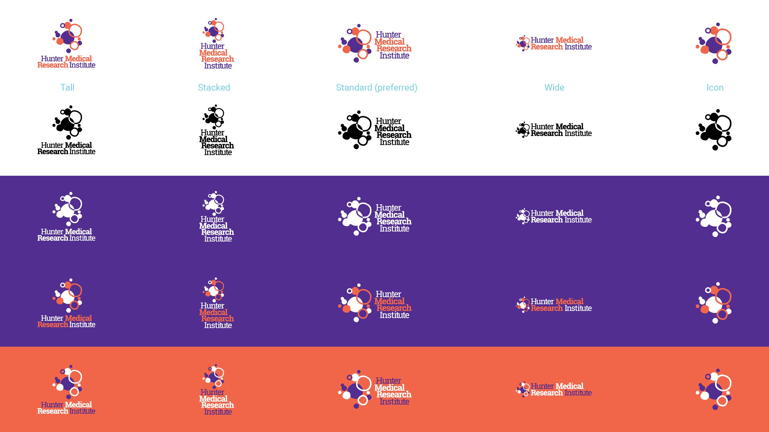
The HMRI logo has evolved with the institute. The current logo consists of 2 parts: the icon and the wordmark.
The ‘standard’ version shown here is preferred. However, there are multiple versions to ensure it can be used across a variety of applications and remain legible and recognisable.
Designer discretion should be used to maintain adequate clear space around the logo to maintain its integrity (at least an ‘M’ all around).
DO NOT modify or alter the logo in any way.
The icon consists of orange and purple organic dots and circles. Dots have featured in previous HMRI logo designs and may be interpreted in many different ways.
The dynamic arrangement shows growth, expansion, energy and the sparks of an idea forming. Their proximity represents connection and collaboration.
Their configuration symbolises science, reminiscent of cells, micro-organisms on a Petri dish, even bubbles or data clusters. Aboriginal artists have also used dots symbolically in their artwork for thousands of years to represent many things: community, people and places.
The icon may be used alone for applications such as social media avatar, where the full logo would be illegible and the name is already displayed.
There are colour variations as per the full logo. Care should be taken not to use the icon in lieu of a full version of the logo if there is any chance of confusion or misrepresentation.
The wordmark font, with its slab serifs, radiates professional authority but remains approachable and friendly.
The full name is spelt out and ‘Medical Research’ is bold to indicate to new audiences the institute’s core function.
In the standard version, the acronym HMRI is stacked, right aligned.
The vibrancy of the colours symbolises health and energy. ‘Unknown purple’ represents the passion of the researchers, searching for answers and overcoming the unknown.
‘Discovery orange’ – warm and enlightening – represents illumination, like the rising sun of a new day, and the optimism of discovery and the joy of good health.
Flexibility is important! Colour options and formats are available to ensure the logo works wherever necessary. Designer discretion should be used to choose the appropriate format if the preferred standard logo is not suitable.
Partnership logos:
As part of HMRI’s partnership arrangement with the University of Newcastle and Hunter New England Local Health District, the partner logo lock-up with community text should appear on all major assets.
For flexibility, there are three colour variations:
- full colour for use on white/light
- black for use on white/light
- white for use on black/dark
Designer discretion should be used regarding minimum size to maintain the legibility of the partner logos.
If space restrictions prohibit the use of the partner logos, the partner wording should be used, set in HMRI’s typeface.
The partnership wording is:
HMRI is a partnership between the University of Newcastle, Hunter New England Local Health District and the community.
Colour Palette:
HMRI’s colours are bold and energetic. Unknown purple and Discovery orange are the logo colours and form the primary palette. Tints of the colours are also permitted.
Primary Palette:

Unknown purple
C 85 M 100 Y 0 K 0
R 82 G 46 B 145
HEX #522E91
PMS267 (please note: the above CMYK and RGB breakdowns are the preferred colours and the PMS should only be used if spot colour is required. The PMS breakdown should not be used.

Discovery orange
C 0 M 75 Y 75 K 0
R 242 G 102 B 73
HEX #F26649
PMS7417 (please note: the above CMYK and RGB breakdowns are the preferred colours and the PMS should only be used if spot colour is required. The PMS breakdown should not be used.
Secondary colour palette:
Tints of the colours are also permitted.

Energy yellow
C 0 M 10 Y 75 K 0
R 255 G 223 B 93
HEX #FFDF5D

Horizon blue
C 50 M 0 Y 10 K 0
R 115 G 205 B 225
HEX #73CDE1

Freshness teal
C 60 M 0 Y 40 K 0
R 96 G 194 B 172
HEX #60C2AC

Gradient
An orange-purple linear gradient may be used as a design element.
Orange ‒ location: 10%
Purple ‒ location: 90%
Angle: 40°
Typography:
The HMRI corporate brand uses typefaces from the Roboto family. These corporate typefaces should be used in all external communications for work produced by creative agencies or sign-writers to maintain a consistent style.
If the Roboto family is not available, Amasis MT Pro Medium should be used as the headline font and Arial should be used for body text. Both are standard in Microsoft Office and will be used for internal communications.
Roboto Slab Bold is used for headlines
Roboto Slab Regular is used for subheads
The sanserif Roboto family is used for body copy. A variety of weights and italic may be used for emphasis as required.
If the Roboto family is not available, Amasis MT Pro Medium should be used as the headline font and Arial should be used for body text. Both are standard in Microsoft Office.
Brand voice:
Our brand voice represents our unique perspective and the values we stand for. It’s our overall personality: curious, down-to-earth and trailblazing.
Our tone of voice is how we communicate with our audiences. We’re helpful, positive and bold.
We strive for all our communication, regardless of audience, to be clear, professional, friendly and helpful. We modulate our tone depending on our audience and message. Sometimes we can’t, or shouldn’t, use all our brand voice traits at once, or in equal measure. We need to make calls about which ones to ‘dial up’, and which ones to pull back or leave out.
Voice traits
EXPERT
We’re trusted, qualified and experienced – so let's use that as the platform to reaffirm that we are a credible source of relevant health information. But we can only do that if we have the courage to stand up and say ‘yes, we’re experts, and you can trust us’.
When being EXPERT, we…
- Do remind people of our qualifications – our credentials, resources, experience and scale.
- Do be as precise as possible – not “HMRI’s researchers”, instead “The HMRI Mothers and Babies Research Program’s targeted nanoparticle team.”
- Do remember that a specific person’s personal expertise is valuable, and readers will associate that with HMRI.
- Do use a person’s full title in the first instance i.e. ‘Laureate Professor Clare Collins AM from HMRI’s Food and Nutrition Research Program’. But in subsequent mentions, this may be shortened to ‘Clare’ or ‘Professor Collins’.
- Don’t come right out and say something to the effect of ‘this is why we’re qualified’. Reference the qualifications, and let readers infer the expertise.
- Don’t expect people to be able to make the link between the subject matter and the qualifications. For example, what does having a large team have to do with being qualified to measure the impact of diabetes? Take them on the journey from basic science to clinical trials to translation and implementation.
We want our voice to excite and inspire, so we use…
CURIOSITY
Research is all about finding answers. Our researchers are caring, passionate and curious people, who are hungry for answers. We want to ignite curiosity in our audience and remind them what it feels like to be inquisitive and thrilled by new ideas and exciting innovations. We want to capture their imagination and get their blood pumping!
When using CURIOSITY, we:
- Do put ourselves in the shoes of someone who might be new to the subject matter – what might this topic look like, what might seem surprising about it, to fresh eyes?
- Do be enthusiastic. Our researchers are caring and passionate people, curious themselves and hungry for answers. We want to express that.
- Do lean into emotion. Though curiosity might be created by information and questions, it’s felt, not thought. So, make them feel something with your words.
- Don’t exaggerate, overstate or deceive. We’re about science and facts. With all that we have to offer, we shouldn’t ever have to make anything up.
- Don’t dumb things down. Go for ‘What might this look like to fresh eyes?’, not ‘How do I simplify this for a child?’. Jargon will always be jargon but try and find inclusive ways to talk about something without talking down to others.
We want our voice to propel us forward, so we’re:
TRAILBLAZERS
We’re not just about research and study. The work we do has a real, tangible impact on the health of our communities – and we need to share this fact far and wide. We have to be bold in our thinking, we need to try new things to find new cures. Same old, same old, won’t cut it. We use the impact we’ve made as evidence.
When being TRAILBLAZERS, we:
- Do identify and spotlight the work/actions of HMRI that advances health (locally or globally). Breakthroughs happen slowly, but explaining novel thinking can help show progress and give an idea of where the research is ultimately headed.
- Do remember that empathy is key here – focus on what part of the progress will get people excited or inspired. Reframe something potentially dry in a more engaging and evocative way. We can still be specific here, but ultimately, we focus on the outcome and impact of our work.
- Don’t generalise – if the progress we’re describing is generic, it’s probably not going to sway anyone. Make it feel real.
We want to help make our community healthier every time we connect, so we’re…
DOWN-TO-EARTH and HELPFUL
HMRI is full of passionate, curious experts, but we can’t assume our audience always understands what they’re talking about. Where we can, we want to give them tangible ways to live their best lives.
When being DOWN-TO-EARTH and HELPFUL, we:
- Don’t use jargon – translate, then communicate. We speak in plain language, professional but friendly. Yes, we’re experts but we’re not authoritarian.
- Do identify specific and exceptional features or statistics to elevate rather than speaking broadly.
- Do ask – what’s the most interesting fact, and what’s the best specific example or representation of that?
- Don’t bury readers in detail – this is about being helpful, relevant and real, rather than comprehensive.
- Don’t mistake interesting-to-you or relevant-to-HMRI for interesting-to-them. Use empathy and ensure you have a clear idea of who your audience is.
- Don’t over-promise. Sometimes our audience have found us because they or their loved ones are experiencing trauma from a devastating medical diagnosis. We don’t want to give them false hope. We can only show them we care and we’re doing our best.
Photography:
Guidelines for brand photography and filming
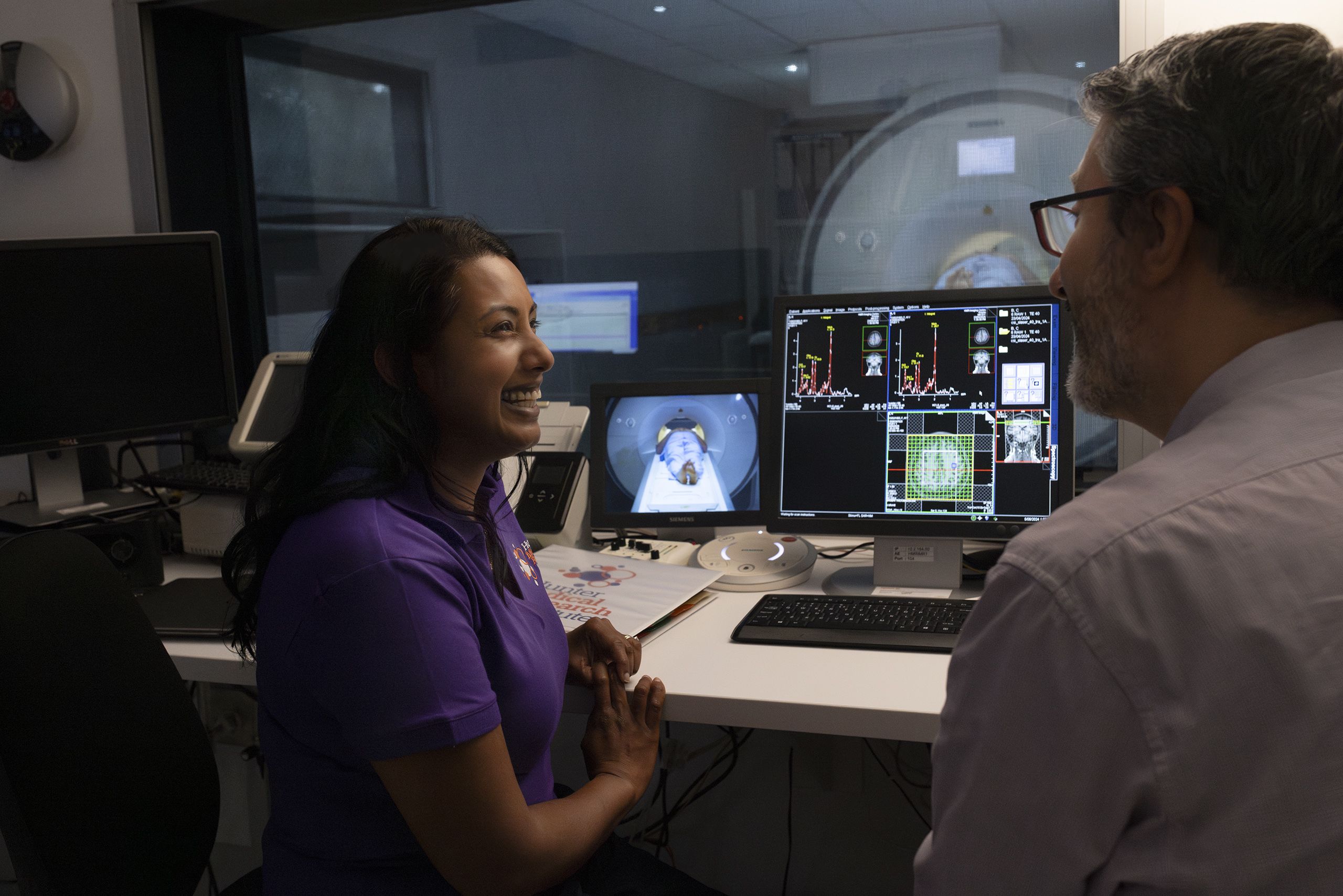
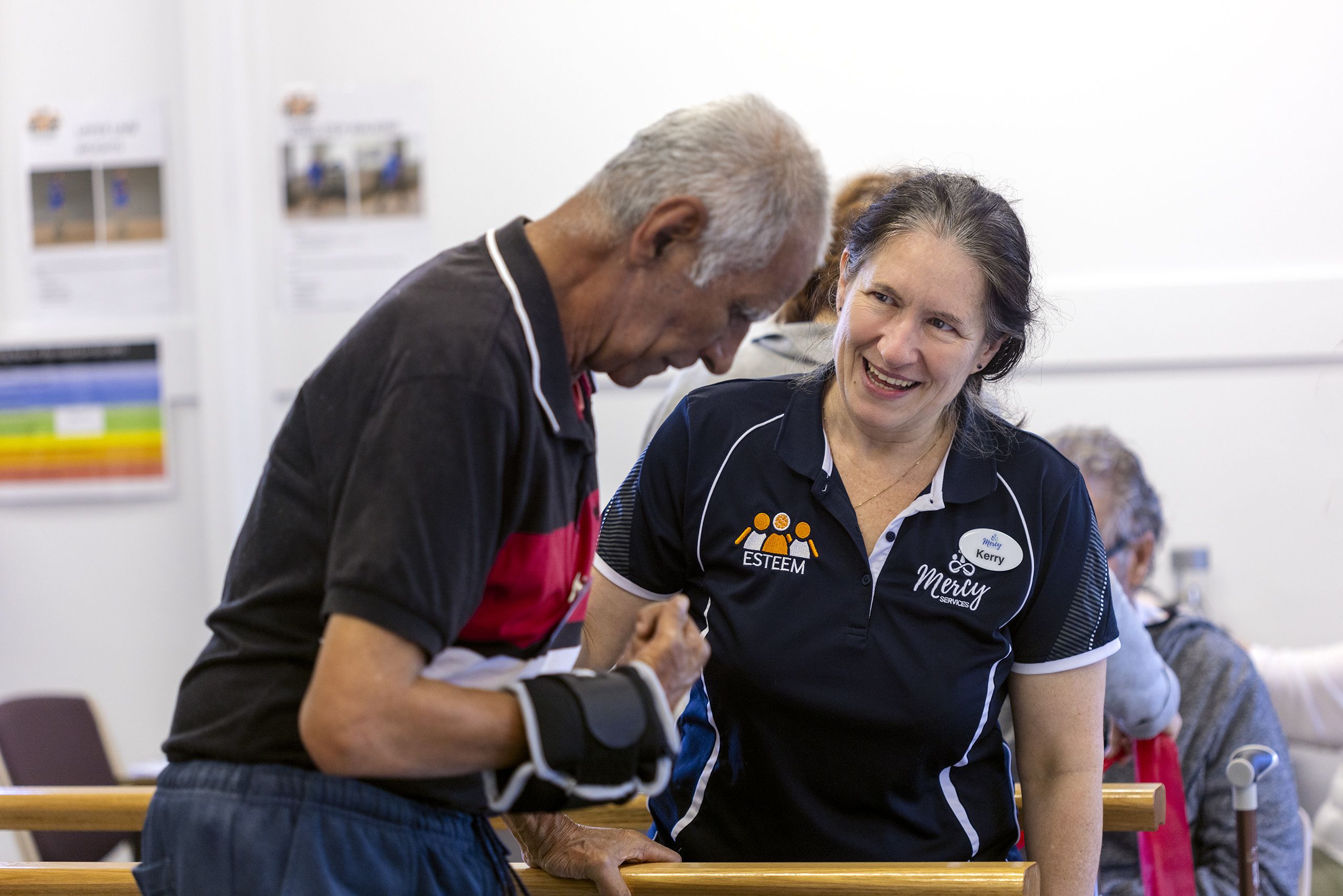
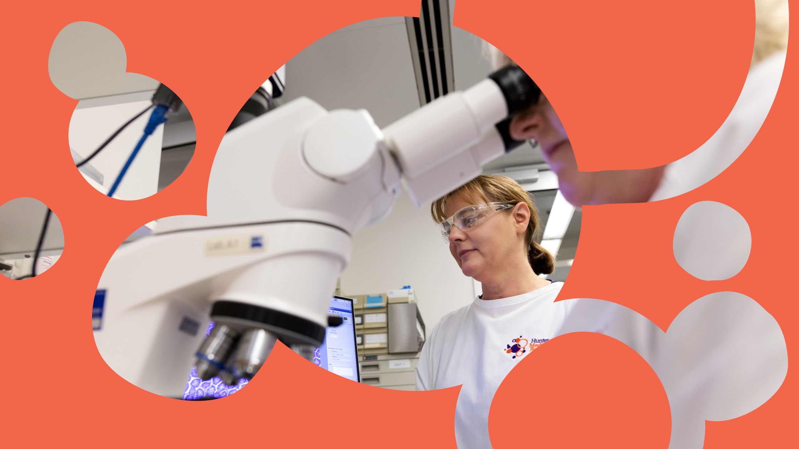
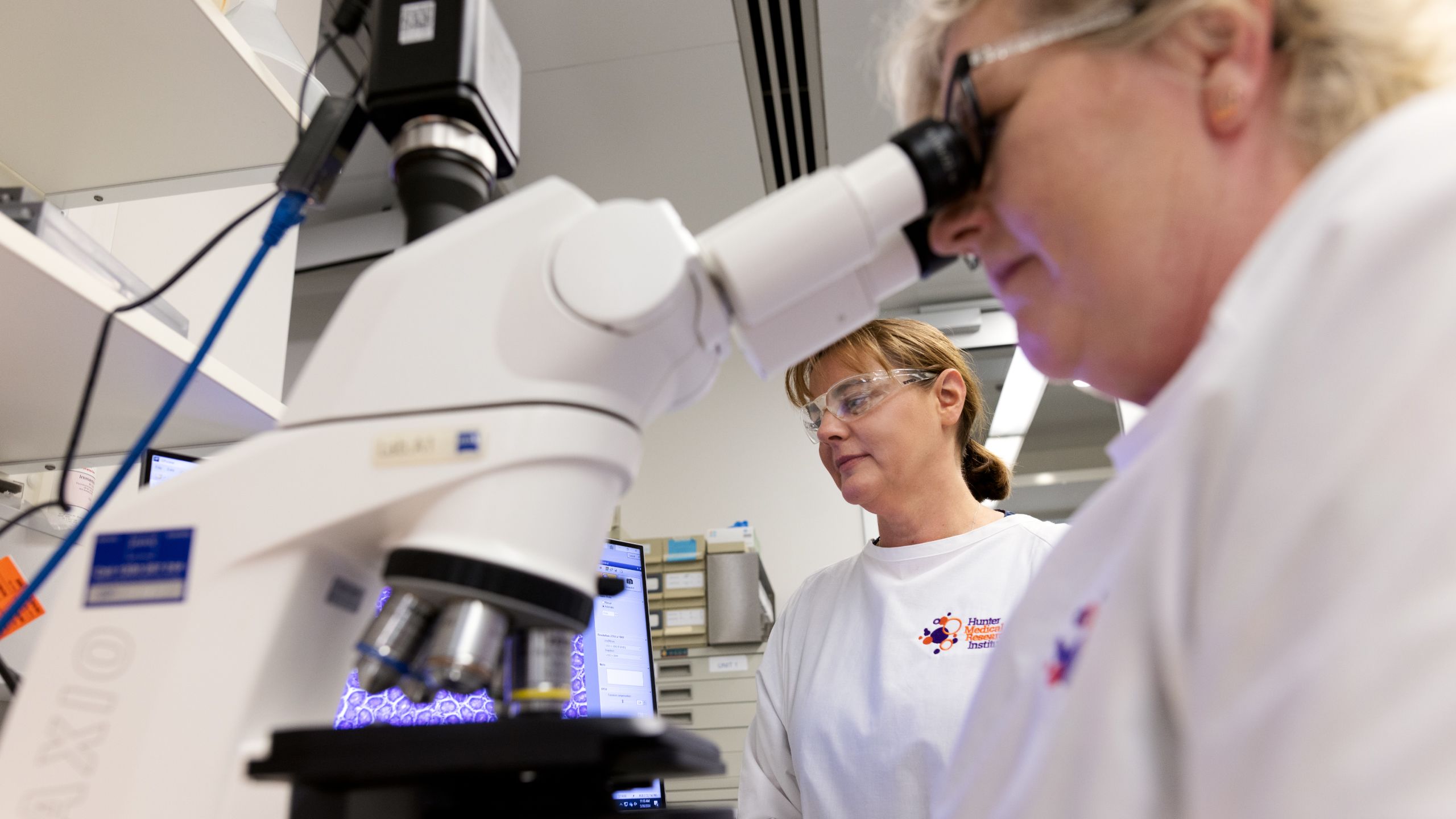
- Use high-quality, real images from our library when possible. There are a variety of candid and posed pictures showcasing the work HMRI staff and researchers do in the laboratory, office, clinical settings and the community.
- People are our heroes. Cool equipment is impressive, but it's the expertise of our researchers and staff that make it work.
- If you really must use stock images, try to pick ones that look like they could have been shot in our region. We're looking for authenticity, candid shots will probably work better than posed.
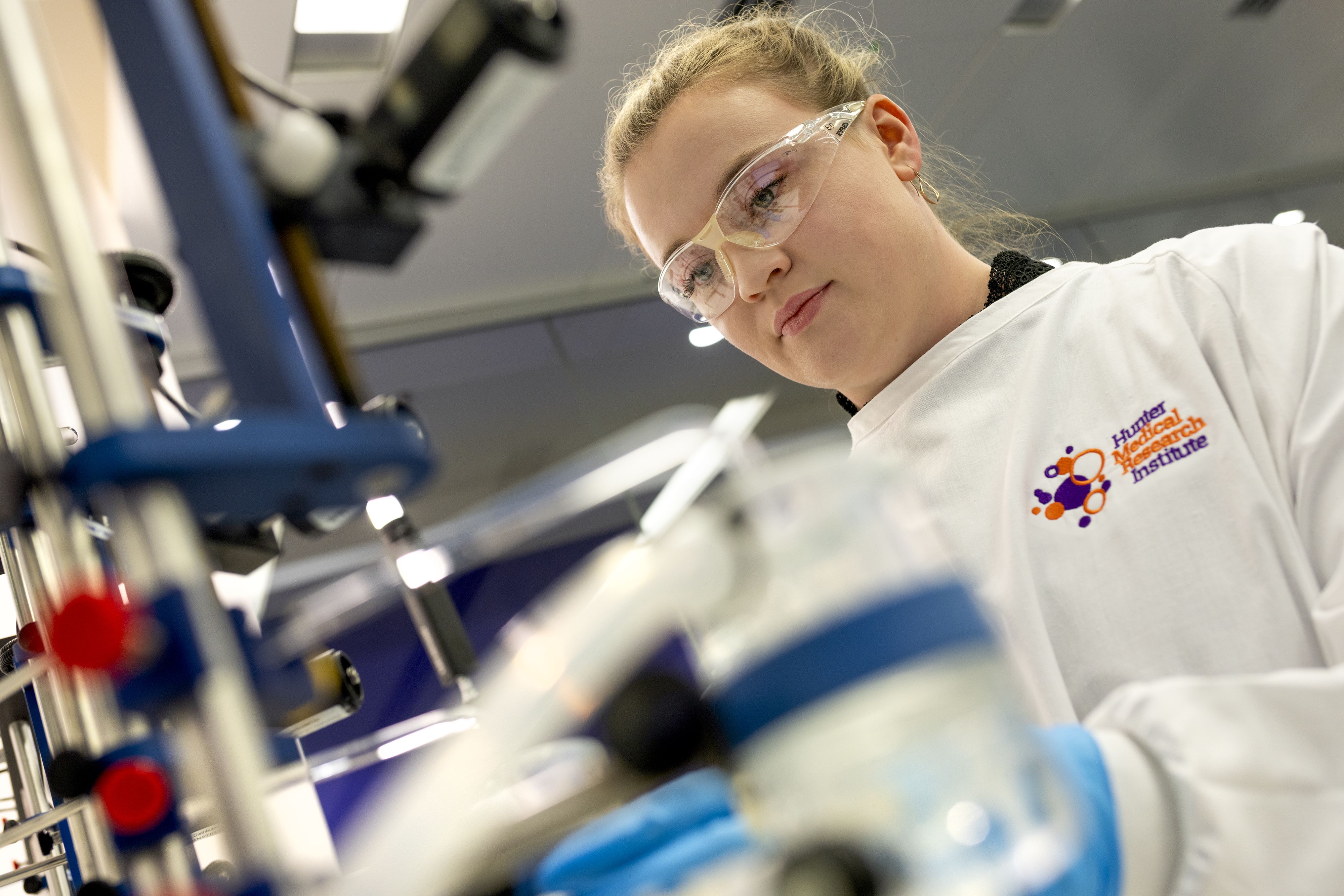
- When photographing or filming our researchers in the lab, please make sure they're wearing correct PPE.
- Experiment with shallow depth of field to highlight specific people or action, creating visually compelling and impactful imagery.
Icons:
An ever growing suite of icons have been created for use in our internal and external communications. The icon style is simple and should be used in the primary palette of purple or orange on light backgrounds, or white on dark.
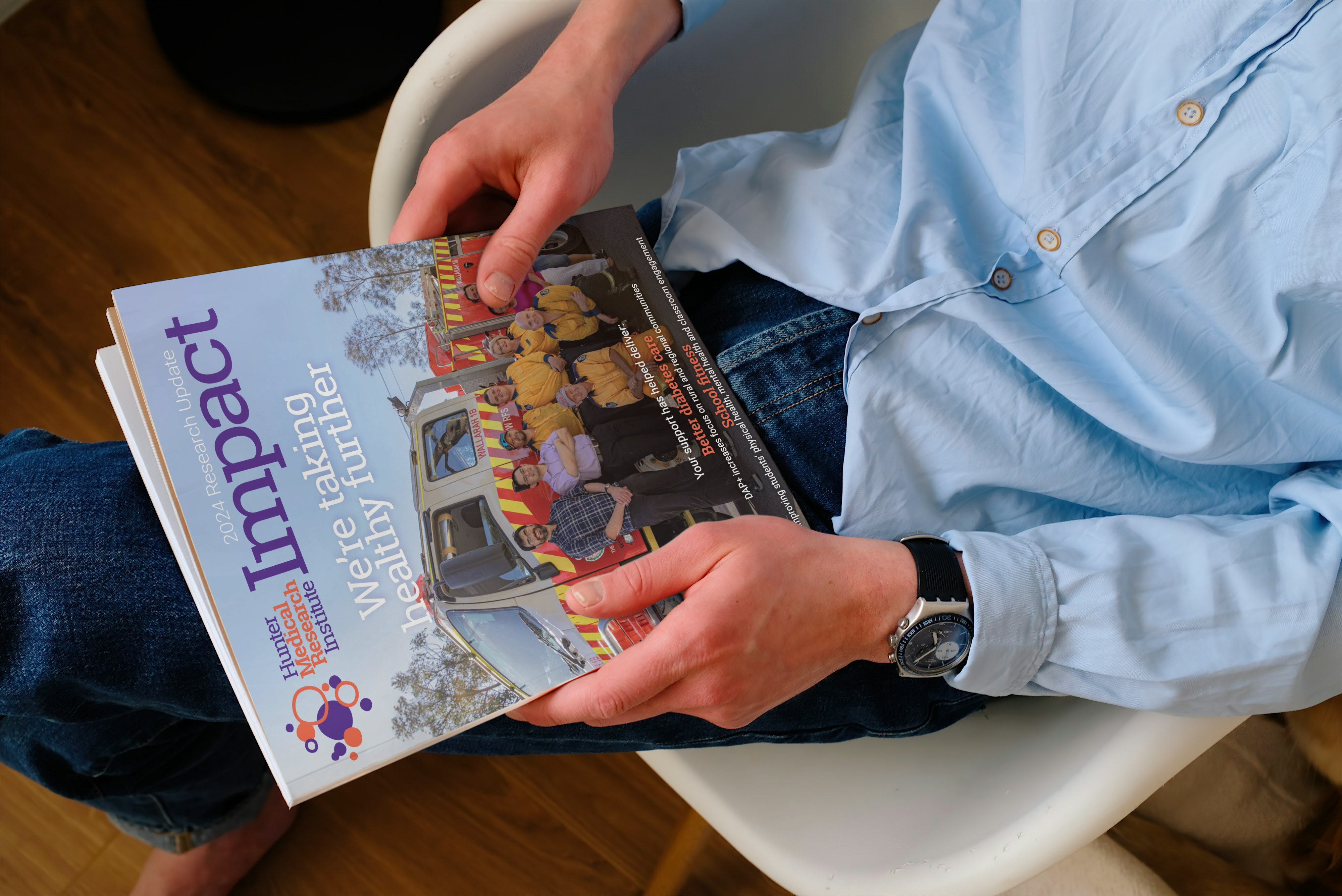
Collateral examples:
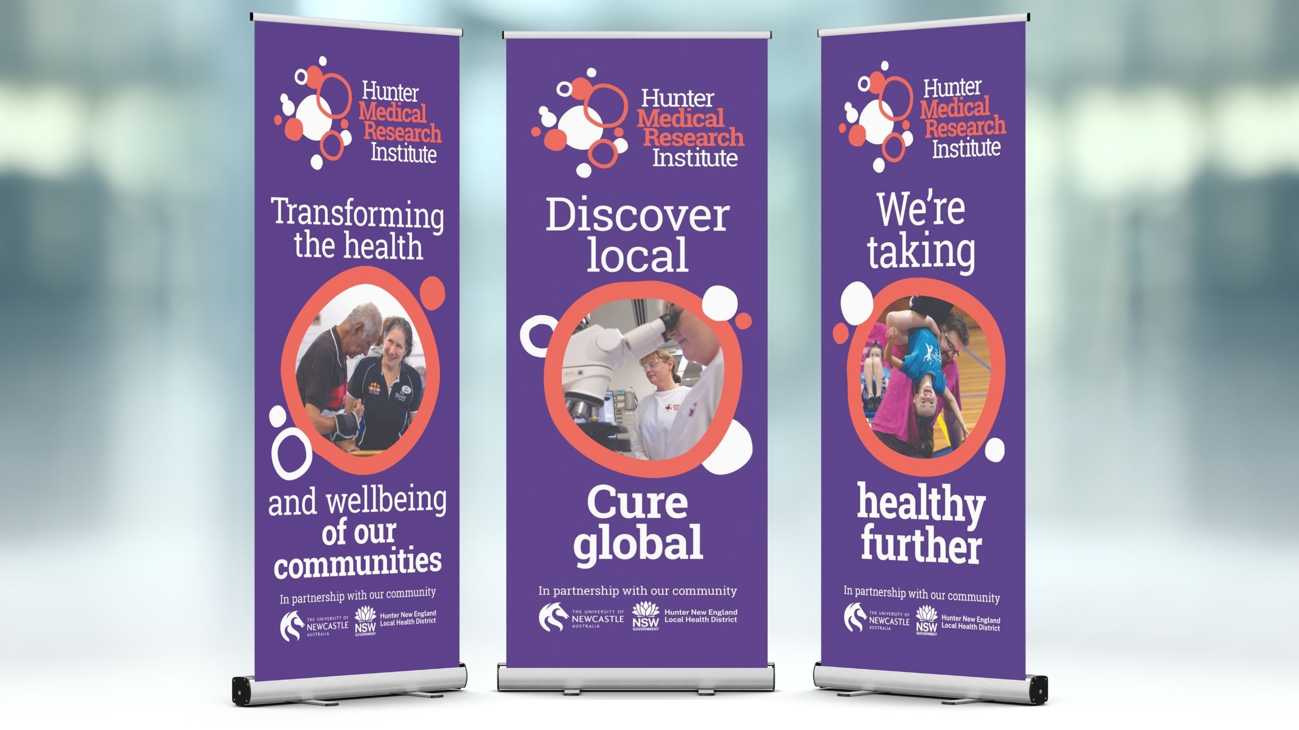
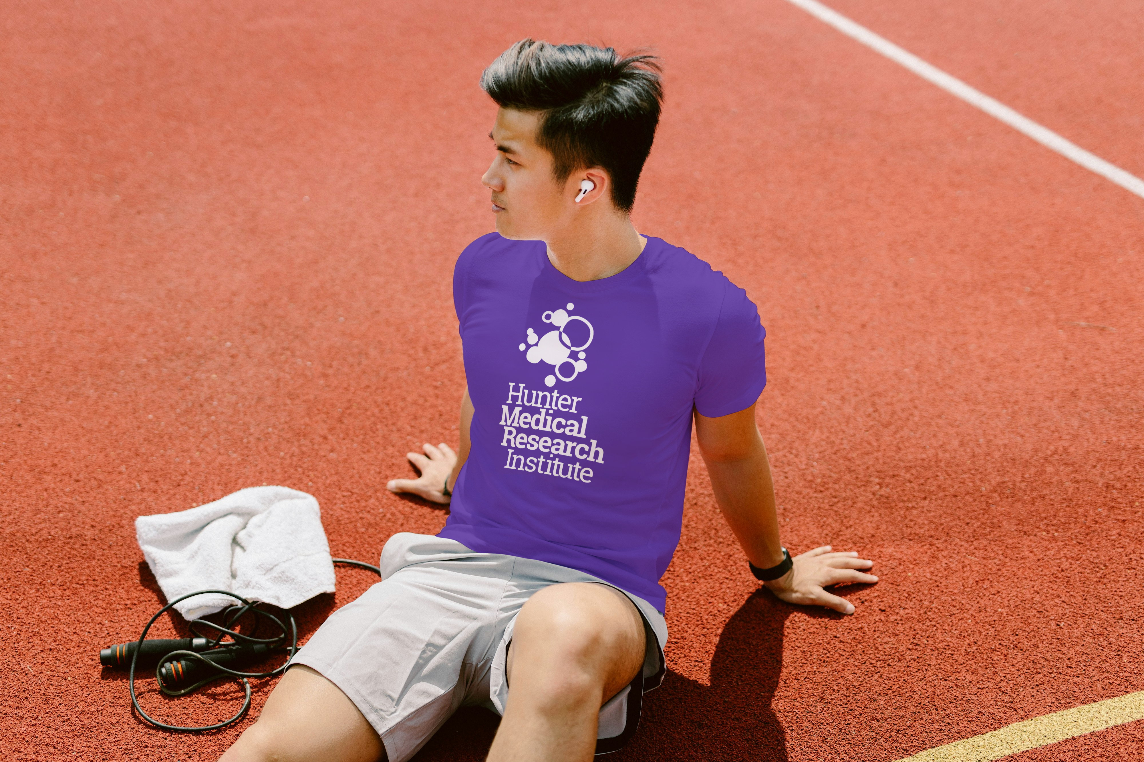
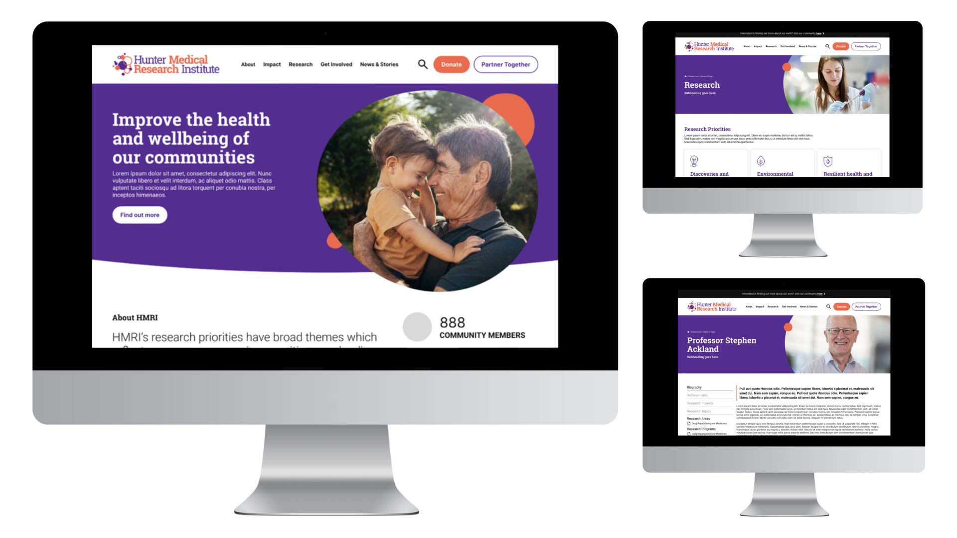
Templates are available in a variety of common formats, including PowerPoint and Word, that can be used for presentations and reports and easily adapted to suit your purpose. The following examples show other ways the HMRI brand identity can be applied. If you require access to templates, please contact the HMRI Marketing and Communications Team.
If you have any questions about our brand and our values or need any clarification or support, please let us know.

